
Visual Identity
↓ Scroll Down To Explore
Our Visual Toolbox
One spike does not make a Siili or “Hedgehog” as our name means. It’s the symphony of all our visual elements playing together that gives our identity life. The Siili identity is clean and simple, yet leaves room for playfulness and experimentation. As with our mascot animal our identity can change form depending on its surroundings. We can choose to be sharp or soft, or even both at the same time.
The Spikes
Friendly but sharp. That’s our visual attitude. Our Spikes are a versatile and undeniably useful graphical element that can be used in endless ways throughout all of our applications and touchpoints. As the hero element or as a supporting role, they make our communication extremely recognizable and inherently Siili. Let the examples below spike your imagination.
Our Spikes can act as a pattern, animated or still.
Our Spikes can be used as an illustrative element in photography
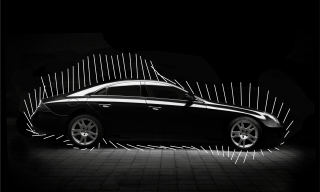
Our Spikes can be maximalist or minimalist
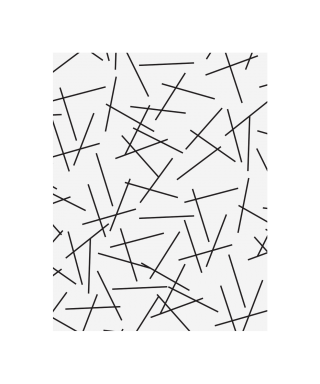
Our Spikes can be actual spikes
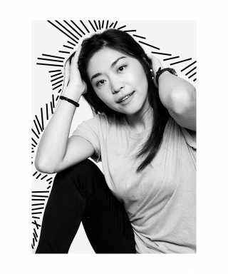
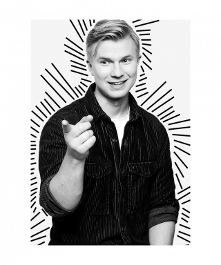

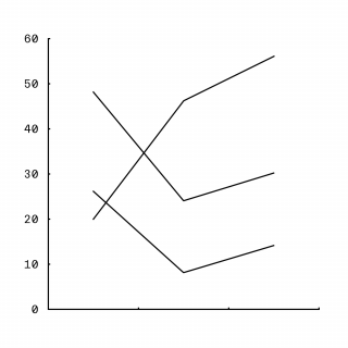
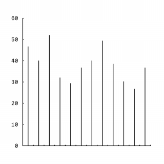
Our Spikes even inspire charts and infographics

The story behind our Brandmark
We are who we are and proud of it. A hedgehog is, in a way, the perfect incarnation of our company. It’s soft yet sharp. It’s easy going yet it has conquered the world. Our Brandmark celebrates this quirky part of our nature, with a sleek and minimalist impression of our mascot animal.
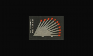
A spark of inspiration from an old matchbox. The essence of our mascot animal. Our Spikes, our “points of view” and professional sharpness turned out to be the basis for our Symbol.
The Symbol
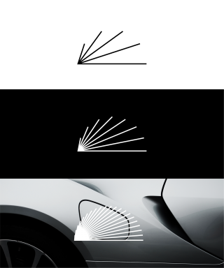
Our Symbol leaves no need for explanation. Besides embodying a hedgehog in its simplest possible form, it’s also multiple perspective lines spreading out from a single vanishing point and a clear expression of the potential for growth. The Symbols three main variants are inspired by the Fibonacci Sequence commonly found in nature. The simplest version with 5 followed by 8 and finally 21 spikes in both static and animated form.
In some cases the Symbol can be used as it is, without the Siili Logotype. Usually these cases are in animation or video products. The Symbol and Logotype don’t necessarily have to be connected, but use consideration when breaking up this lockup.
The minimum width for the Symbol is 4 mm. Do not use the Symbol in smaller sizes.
Moving Brandmark
In an increasingly digital world of online platforms and moving images, it’s important that our visual elements are dynamic and can move too. This helps us stand out in any type of media.
Logotype
Our Logotype is simple and straight-forward with no need for fancy tricks. It’s timelessly elegant, set in our grotesque typeface Everett, and perfectly complements our Symbol and vice versa.
As with our Symbol, our Logotype can in some cases be used as it is, without the Siili Symbol. Usually these cases are in animation or video products. The Logotype and Symbol don’t necessarily have to be connected but, as earlier stated, use consideration when breaking up this lockup.
The minimum width for the Logotype is 6 mm. Do not use the Logotype in smaller size than this.
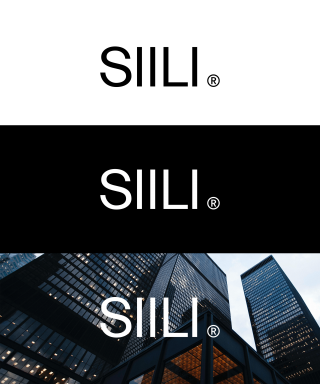
The Brandmark
Our Brandmark is the combination of our Symbol and Logotype. We have three main versions of the Brandmark to be used in most circumstances. With 5, 8 and 21 spikes. We use these versions freely and select based on the designs they are applied to.
With justification, the Brandmark lockup can be broken up to create a more coherent design solution. In these cases our Logotype can even be scaled and used bigger than in the lockup. In these circumstances there’s just one important principle to always adhere to. When breaking the lockup, the Symbol and Logotype are never placed directly next to each other.
The minimum width for the Brandmark is 6 mm. Do not use the Brandmark in smaller size than this.
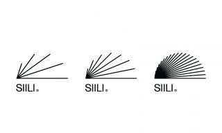
The Symbol and the Logotype should primarily be used in the official lockup, but can be broken up if it serves a function in the design.
Safe Area
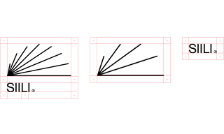
Our Symbol, Logotype and Brandmark each have a safe area to respect. These safe areas are determined by the distance from the left of the “L” to the leg of the last “I” in the Logotype.
Do not place any graphical objects or contrasting elements from background photo material inside the safe areas in any circumstances.
The Don’ts
Here are some obvious and some less obvious examples of use cases that are not allowed under any circumstances when using the Symbol, Logotype or combined Brandmark.
For example:
Never stretch or transform the proportions of the logo.
Never use the logo in any other colours than black and white.
Never create new lockups of the Symbol and Logotype.
Never, when breaking the lockup, place the Symbol and Logotype near each other.
Never use any effects on the logo.
Never use the logo on a background with strong contrasting elements.
Sub Brands
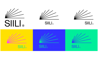
Our Sub Brands follow a system based on the master Siili Brandmark. Sub Brands are ideally displayed each in their own colours based on our Brand colours to clearly differentiate them from the master Siili Brandmark.
The Sub Brands exist in two Logotype variations. The standard and the animated version that playfully turns the two first “I”s into square brackets.
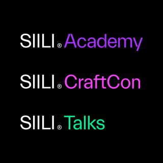
As with our Brandmark, the Sub Brands come in eye-catching animated form.
Brand Colours
Our identity is bright with contrasting colours. The main colours, which are not actually colours to be scientific, are white and black. We consider the white a blank canvas for our imagination. It makes the Siili identity timeless and extremely flexible. Our main colours do not steal the show from our content and thinking, but perfectly support them.
To complement the white and black we use our bright brand colours: Real Yellow, Real Green, Real Blue, Real Purple, Real Pink, and Real Red.
Our brand colours are strong and demand a certain attention from our audience, so we use them with care. As a brand we are not loud, but clear and aspirational. We design for accessibility and always make sure our text is readable with clear contrast to the background colour.
For example:
We like to use white for background, black or grey for text, and contrast with a splash of colour from our brand colour palette. One complementary colour is usually all it takes to give it that Siili flavour.
Real White
HEX FFFFFF
RGB 255,255,255
PMS White
CMYK 0,0,0,0
Real Black
HEX 000000
RGB 0,0,0
PMS Black
CMYK 0,0,0,100
Real Yellow
HEX FFE100
RGB 255,225,0
PMS 107
CMYK 0,5,100,0
Real Green
HEX 00F09B
RGB 0,240,155
PMS 802
CMYK 65,0,45,0
Real Blue
HEX 3232FF
RGB 50,50,255
PMS 286
CMYK 100,95,0,0
Real Purple
HEX AA32FF
RGB 170,50,255
PMS 814
CMYK 68,78,0,0
Real Pink
HEX FF41FF
RGB 255,65,255
PMS 807
CMYK 0,85,0,0
Real Red
HEX FA0000
RGB 250,0,0
PMS 032
CMYK 0,100,100,0
Accessibility
Always design with accessibility in mind.
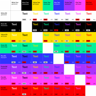
We use colours that provide enough contrast between content and background, so that text and non-decorative images are legible for anyone with low vision or colour vision deficiencies as well.
Contrast ratios are used to measure the relative luminance between colours ranging from 1 to 21 (commonly written from 1:1 to 21:1). The contrast ratio between text and background should be at least 4.5:1.
The story behind our typeface
Our typeface is sharp for a reason. We are widely known as a friendly, easy-to-approach company and people. But this should not be mistaken for softness. We have strong opinions and our writing always looks clear, professional and convincing. Our writing shows our spikes.
Typography
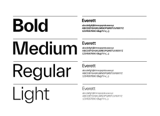
Our primary Typeface is the elegant and timeless grotesque: Everett. Drawn by Nolan Paparelli, this sharp typeface has elegant forms and sharp cuts. It fits perfectly within the Siili identity and is used as the base for our Logotype. It’s a minimalistic typeface with depth and variation that allow our employees freedom of expression through its flexibility.
When we write we create strong visual hierarchies by using size, weight and colour. It allows for clear distinction between heading, subheading and body copy and it brings rhythm to the designs. It’s essential in making sure our messages reach our audience with zero dilution.
We create an even clearer hierarchy but using different cuts of our typeface. Our rule of thumb is to skip one weight and never to use two neighboring weights. This allows for better contrast and is simply a good practise in typography.
When using colour in typography, we use it prudently. We are not loud. We are sharp. See the colour section for a more in depth explanation of the Siili colours.
We use five cuts of Everett: Light, Regular, Medium, Bold and Mono. Everett Mono is great for numbers and charts.
Our secondary typeface is Arial. We use it only in situations where our primary typeface Everett is not available for use.
Grid
One of the centerpieces of the Siili identity is the Grid which gives our design rhythm and harmony. It establishes simple rules that are easy to follow and lead to clear and understandable design. It’s our visual recipe if you mind.
Our grid can vary depending on the final product. Our grid of rows and columns are set as guides to aid the design process. It includes a baseline grid when creating publications, such as magazines, books, etc. Our grid is not an unbreakable rule. It’s a useful aid and should be used accordingly. It inspires the simple and timeless Siili designs and layouts.
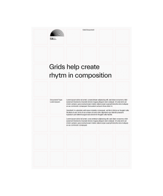
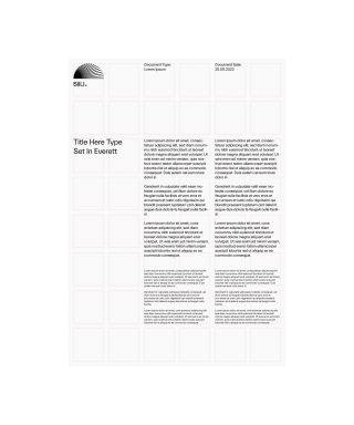
Our grid creates order and harmony in our designs.
Images
Cases
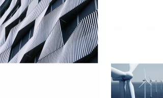
As our cases are as various and multifaceted as our clients, we keep our case images as minimal and simplistic as possible. We treat images as information. Make the message clear and singular. The more noise or unnecessary elements, the harder it is to read an image’s story. But this doesn’t mean we are boring. For example we use interesting, even surprising angles, and always keep the professional level high. Visually and technically.
Our people
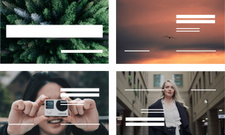
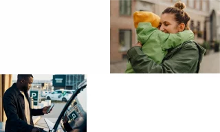
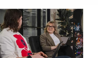
Our portrait images are a direct reflection of our people. Honest, up close and always personal. We keep it realistic, because that’s who we are. We make it interesting in how we frame our images with unconventional cropping. There’s no rules set in stone when it comes to how we present ourselves, as each individual tells their own story.

Background
This is an evolution to Siili’s brand heritage with AI
We are staying true to Siili’s brand heritage, and tweak with a fresh, progressive look. The focus is on quality, elegance, and craftsmanship attitude — we need practical ways to tell compelling stories from present to future.
We want to avoid AI clichés to stand out. The visual style combines natural, artistic textures with a clean and organized design. Shapes and ideas take form through layered materials, symbolizing growth and expertise.
Siili’s brand colors are refined for a softer, more sophisticated and premium feel. AI-generated imagery will follow a clear framework to ensure cohesiveness.
AI-generated Visuals
SIILI Midjourney profiles: Our key to consistent, high-quality AI-generated visuals
Midjourney is an AI-powered tool that transforms text prompts into images. Midjourney profiles are custom settings that guide the output to fit specific requirements.
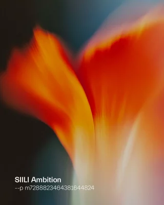
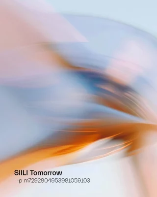
We have created two Midjourney profiles, Siili Ambition and Siili Tomorrow. These are custom-trained aesthetic settings that ensure all AI-generated images align with Siili’s visual identity, mood, and artistic direction.
Instead of relying on random outputs, these profiles guarantee cohesion, precision, and brand consistency across all AI visuals.
The simple Formula
1. Create simple prompt. Apply the profile.
2. Generate images. Curate.
3. Repeat if necessary to reach the perfect outcome.
Evolution to Siili’s brand heritage
Why this AI-image style works for Siili’s brand story towards AI-Transformation leader positioning?
Our offering spans from maintaining concrete systems to guiding business & tech strategies.
As AI changes the operating environments for our clients fast; we need to be able to visualize what doesn’t exist yet.
We grow our capabilities from AI-powered software developer to AI Transformation leader.
When visualizing present day solutions we use realistic
photographs and subtle styling with AI.
When visualizing future and forward looking solutions
and concepts we use abstract styling.
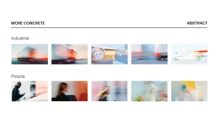
Midjourney settings
Recommended Midjourney settings
// for MJ model 6.1
MODE: Standard.
AESTHETICS
Stylization: 200 to 500
(Cannot be zero for profiles to work)
Weirdness: 0
(Not compatible with profiles)
Variety: According to your preferences.
Prompting Guidelines
This is a guide, not a rulebook
Like brand fonts and colors, the Midjourney profiles ensure consistency but can still be misused. While we guide quality imagery, we can’t prevent dystopian or off-brand prompts.
In Siili’s tone of voice guidance, we say that our outlook on future is positive. We are confident and enthusiastic about what we can do for our clients and with our partners. We avoid creating negative images of the future.
Siili’s values are Ambition, Humane, Joy and Responsibility. We aim towards premium quality, in an enthusiastic way and drive responsible change for our customers business.
Success depends on users – The profile supports consistency, but the right prompts and choices make it work.
Ask ChatGPT to find out prompt ideas
For example, ask ChatGPT to investigate a client website for ideas of image prompts
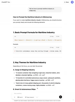
Ideate image prompts with ChatGPT.
Instead of using basic and obvious prompts e.g. image of a credit card for banking images. You generate more symbolism, emotions and abstract ideas with ChatGPT.
Prompt example;
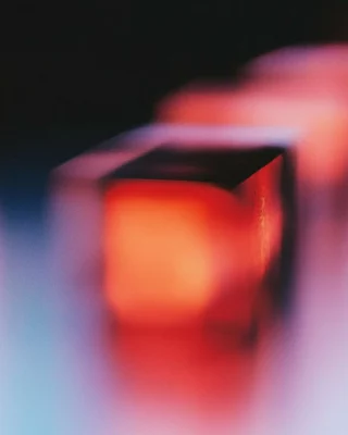
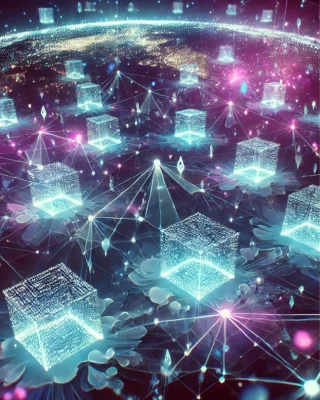
“Abstract representation of decentralized finance
ecosystem, smart contracts floating in digital ether,
peer-to-peer nodes, glowing blockchain networks”
WITH PROFILE
WITHOUT PROFILE
Mood & style tips
Curate everything. Use the best, skip the rest. Even with the profiles applied, every output is not equally successful and/or usable.
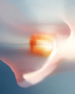
WITH PROFILE
“Bright Future”
WITHOUT PROFILE
“Bright Future”

GO FOR
Optimism

AVOID
Dark, dystopian mood

GO FOR
Positive mood
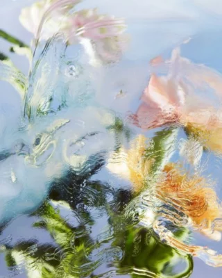
AVOID
Uncanny valley
GOR FOR
Wow effect
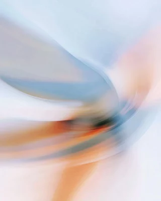
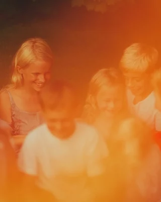
AVOID
Vintage effect
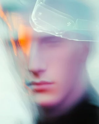
GOR FOR
Motion blur, feeling of movement
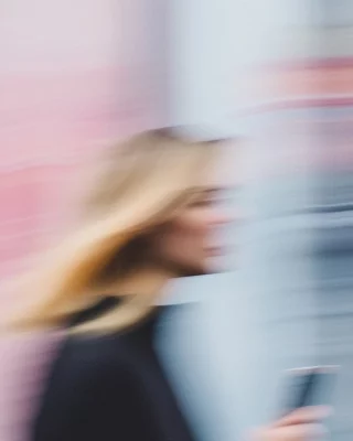
AVOID
Sharp images of people

For specifics, use reference
If you need something specific and concrete for your image, try using a reference image. This can help you capture the desired subject matter while maintaining the Siili image style. For copyright reasons, only use images created with Midjourney.
1. Create a reference image using Midjourney without a Siili profile.
2. Use the created image, add the Siili profile, and generate.
3. Adjust Stylization to refine the result: A higher Stylization setting – up to max level – emphasizes the Siili visual style (recommended).
A lower setting keeps the outcome closer to the reference image’s style.
Tech disclaimer
These guidelines and settings were created for Midjourney 6.1 and are accurate as of this writing.
However, things change — especially in AI — so these guidelines will be updated regularly. If the profile function is removed in a future update, the images produced with these settings can still serve as style references for future systems.
Legal disclaimer
Always be careful when uploading materials to an AI image tool
Make sure that you have the legal right to upload an example image to guide prompting. Never download images from websites and then upload to Midjourney.
Keep the Siilis real
Do not use the profiles for staff images.
Let’s keep the Siilis real.
However, you can use a prompted image as a frame along with a staff photo. This image can be tailored for each Siili individually, reflecting their persona and/or expertise.
Best practices

Illustrations
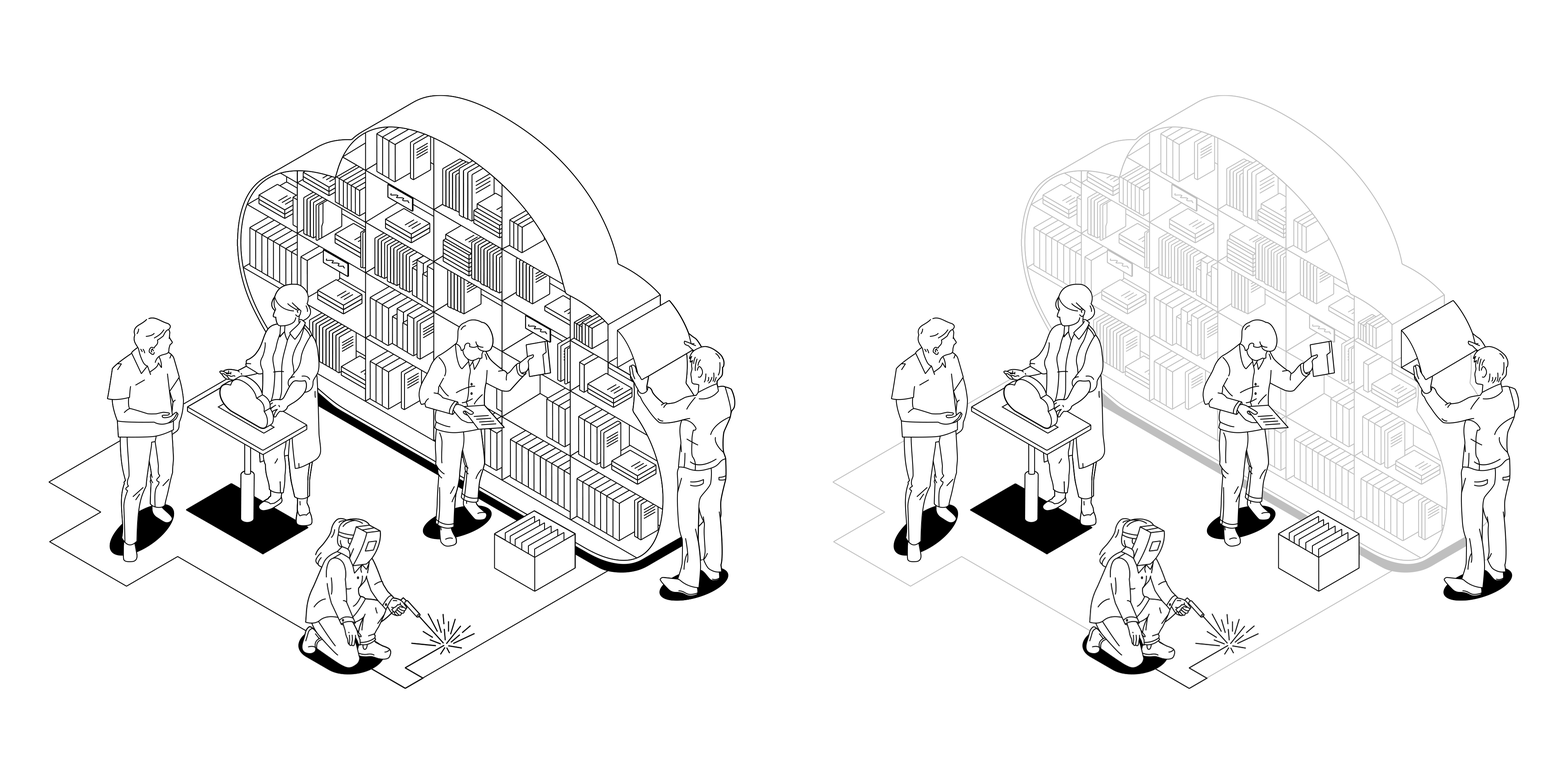
Illustrations can simplify complex concepts.
Our illustrations are clean and airy, with a splash of playfulness. Due to the shared isometric perspective and monolinear strokes, it’s possible to create new compositions by combining elements from multiple illustrations.
Icons
Our icons are simple, airy and straight-forward. With monolinear strokes and side view, they are in line with our other visual assets such as the Spikes. Their perspective is flattened, unless an icon absolutely demands something more volumetric.
In original icon files, the icons are drawn within 22 x 22 mm artboard, with 0.4 mm stroke weight. Stroke is outlined so it will scale proportionally with icon’s size. Always use the original icon files, do not modify or recreate icons. In print, minimum width for the icons is 11 mm (artboard size). Stroke weight will then be 0.2 mm.
